 |
|
SINOPSIS
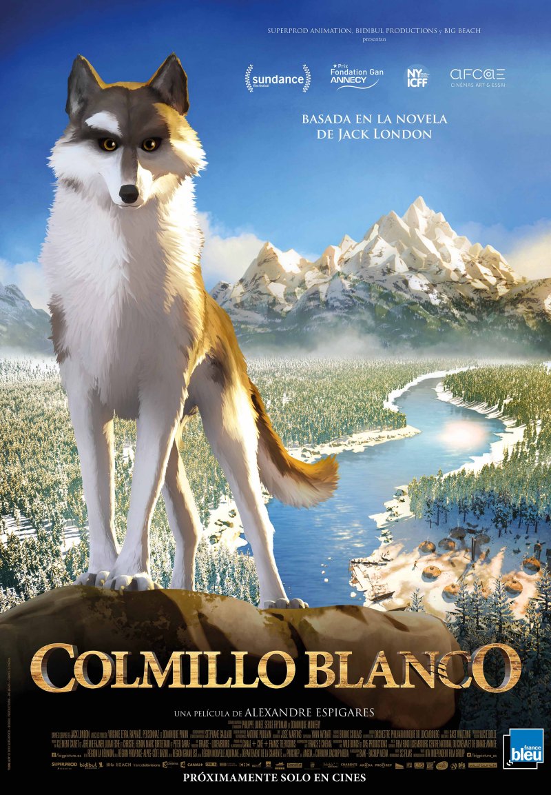
Un niño se hace amigo de un lobo mientras intenta encontrar a su padre, desaparecido en extrañas circunstancias durante la fiebre del oro...
INTÉRPRETES
Animación
MÁS INFORMACIÓN DE INTERÉS
![]() CRITICA
CRITICA
![]() CÓMO SE HIZO
CÓMO SE HIZO
![]() VIDEO ENTREVISTAS
VIDEO ENTREVISTAS
![]() AUDIOS
AUDIOS
![]() PREMIERE
PREMIERE
MÁS DATOS...
 INFORMACIÓN EXCLUSIVA
ENTREVISTA AL DIRECTOR...
HOW DID YOU COME TO THE PROJECT?...
Late 2014, I was contacted by Lilian Eche one of the film’s producers, who offered me the chance to direct White Fang. I read the screenplay and was instantly won over. The story speaks to me because it’s so far removed from your regular family animation movie. My fi rst refl ex was to turn it into a Spaghetti Western. I’m a big fan of the genre and it was a chance for me to give it a go. For once, the animals don’t talk or sing. We have animals in the wilderness. Zero dialogue. This was something that absolutely had to be kept. Even when White Fang joins the human world, I wanted to keep dialogue to a minimum. Films should tell stories through pictures and not words, that’s what they’re there to do. Sometimes animated movies take viewers by the hand and over-explain plot - that’s not necessarily a criticism.
It’s especially done for kids, thinking they won’t understand. I don’t believe this to be the case.
Then I met Stéphane Gallard and Antoine Poulain, the concept artists, who had already spent quite a bit of time working on the characters and their appearance. Their work began to grow on me and I began to really like the direction they were going in: designs with augmented realism, where characters’ proportions are exaggerated in relation to reality. Some are almost caricature. I love the guys’ grim Klaus Kinski like faces in Spaghetti Westerns, the permanent half-sneer.
They were creating the same kind of faces. Just what I wanted. We kept going in that tion and I showed them shots of Sergio Leone and Sergio Corbucci characters, and we started working on them to create the rest of the human wildlife in Fort Yukon.
ANY PARTICULAR REFERENCES INVOLVED?...
There’s a whole smorgasbord of them (laughs). Westerns, of course, THE GREAT SILENCE by CORBUCCI and his DJANGO with FRANCO NERO. Also SIDNEY POLLACK’S JEREMIAH JOHNSON, and JOHNMILIUS’SCONAN THE BARBARIAN, one of my favorite ever movies. I also have a penchant for BROTHERHOOD OF THE WOLF and the work of CHRISTOPHE GANS in general.
A LOT WAS ALREADY IN PLACE WHEN YOU ARRIVED ON THE PROJECT. WAS THERE MUCH MARGIN FOR MANEUVER?...
The fi rst thing they said was, «This is your fi lm, take it.» I reworked the screenplay the way I wanted it. There were two versions, the older version and the one Philippe Lioret worked on. I got to pick and choose what worked best in both versions – to merge scenes or cut them. That way we got together a well-paced screenplay with the right stakes, that everybody in the team liked. Then we moved onto the storyboard which helped us realize that what worked in writing didn’t necessarily work in pictures. Sometimes there was excess.
Once we’d made the animatic (a dynamic slide-show of the story-board), we noticed the fi lm was still too long. We had to trim it down and rebalance the narrative.
Smooth it out. Some characters had to go (because of time constraints and budget).
Gradually everything fell into place.
HOW MUCH DID YOU REFER TO JACK LONDON’S NOVEL?...
I read White Fang to get the feel of it before the screenplay work. I only had a mental image of the novel.
I knew it by name, but I had never read it before. I had a cliché in mind of a wolf in a forest and wide open plains.
The novel isn’t like that at all. I realize that even people who have read the novel don’t always remember the brutality in it and those really violent passages. What we remember is the wolf-cub running through the woods with his mother, but then we blank out the dog fi ghting and men. So I reworked the screenplay to remove the on-screen violence but then brought it back in different ways. To create a sense of the brutality without actually showing it. We used sound and light to restore what was lost in terms of action.
WHAT GENERAL GUIDELINES WERE YOU FOLLOWING?, WHAT DID YOU SET OUT TO DO?...
I wanted to stay close to WHITE FANG, keep the same perspective and make him the hero of the story. Exterior scenes had to be almost naturalist, documentarystyle.
This approach had to be adapted when the story demanded it, especially the dogfi ght scenes. I wanted to keep the overriding feeling of melancholy. I didn’t always want to go for the obvious but instead try something unexpected. I also wanted to somehow highlight WHITE FANG’s mixed genes, both dog and wolf.
Depending on the scenes, we had to establish which side of his personality would predominate. This duality between his inner-nature and what life teaches him was invaluable for directing the movie. This duality reaches its pinnacle in the scene where WHITE FANG is about to attack BEAUTY SMITH and MAGGIE stops him. For one instant, WHITE FANG is caught in two minds: listen to his innerwolf and tear his tormentor to shreds or behave like a domesticated animal and obey his master. He ultimately changes his mind and listens to MAGGIE. We always brought the focus back to WHITE FANG. In a way, humans are simply «extras» in the movie. They’re just guys passing through WHITE FANG’s life. The camera is often at human hip-height, roughly head-height with WHITE FANG. We’re with him all the time without sharing his actual subjective point of view. We played around a lot with the sound. Like when WHITE FANG heads into town. It’s somewhere he’s unfamiliar with. There are sounds he doesn’t know. The crowds, the saloon bar piano, the laughter and people shouting, the clatter and scrape of boots on wood – everything together creates an almost aggressive soundscape.
There is a stark contrast with the smoother and more balanced sounds of nature.
YOU CHOSE TO WORK WITH CINEMASCOPE?...
The choice was fairly obvious for the subject matter. I wanted to give prominence to the vast landscapes. And when we’re working tight close-ups with characters, the audience has to have already captured enough information about the environment from previous scenes.
I wanted to get enough out of the decors to enhance the tighter frames. Also fairly often there are blurred or empty areas. I wanted the viewer to be able to recreate in her mind’s eye what is going on outside the fi eld of vision.
ONE OF THE STRONGEST SCENES, BOTH GRAPHICALLY AND DRAMATICALLY, IS WHEN A LYNX ATTACKS WHITE FANG AND HIS MOTHER…
I approached the sequence from a very technical perspective. The geography of the fi ght area had to be clear as well as where the characters move.
I don’t like fi ght scenes where you can’t actually locate characters in space; I disconnect from them. I need to be able to situate where the action is taking place at any moment. Action sequences in American productions tend to be overcut as they try to maintain the dynamics. That’s why I love Hong Kong cinema, which gives prominence to wide shots, offering characters greater scope for action.
For this sequence I sketched out a map, situated the characters inside it and very precisely mapped out their movements. I wanted to bring out the idea of the lynx as a creature born of his natural environment. Before we even get to see him, I wanted the vapor of his breath to be visible.
IT IS AN EPIC ADVENTURE, BUT THE CAMERA MOVEMENT NEVER GOES OVERBOARD WITH THE LYRICISM, IT’S INVOLVED WITH THE NARRATIVE…
I limited camera movements to a minimum. I’ve often preferred static shots or subtle fl oating camera movement. When the camera moves, it has to be for a precise reason – to highlight the narrative aspects going on in the shot. I didn’t want a totally free camera. I told the layout team to think like a cameraman. You’re on set with dollies and cranes, and obviously you have certain technical constraints, like camera height. Sometimes I did slip in a few exceptions to the rules. Like when the camera chases an animal in motion. I didn’t want the camera movement in-synch but just out-of-synch to give the impression the cameraman doesn’t know where the animal is going. I’d always ask for a few frames latency to simulate the time lapse between the animal setting off and the cameraman trying to catch up and get it back in focus.
PART OF THE MOVIE IS FILMED IN MOTION CAPTURE… WHAT CONTRIBUTION DID THAT MAKE?...
This was crucial for the crowd scenes. Especially the concentrated masses for the dogfi ghts. We’d group actors together somewhere then move them. The way they moved was always different whereas usually, in traditional animation, movement is always the same, as though cut-and-pasted. Instead the crowd we got is very alive; characters speak to and interact with each other. Motion capture helped us achieved that sense of realism, I mentioned earlier.
SO THERE WERE ACTORS TO DIRECT TOO?...
I’ll confess I was slightly dreading that part. As an animator I’m used to working alone in front of a screen or a mirror. We rarely have any direct contact with actors; the nearest we get is when we get videos of dubbing actors’ voice recordings.
But here I actually got to direct actors and it was great. Actors bring their own movements and mannerisms which give a unique personality to characters. It real helps direction, especially when it comes to facial expressions. The same applies to dogs. When he runs, Hermes (the WHITE FANG motion capture dog) has a tendency to shake his head, a detail we’d maybe never have thought of and which lends great personality to the character in the fi lm. What’s more, dogs rarely run in straight lines, whereas in animation, it’s a refl ex to use straight lines: it’s much easier technically. Motion capture helped us fi lm and retranscribe much more erratic paths of motion with all the «accidents» we wanted for that touch of extra naturalism in movement.
THE LIGHTING WORK IS VERY IMPRESSIVE; BOTH BEAUTIFUL AND POWERFUL IN THE NARRATION…
The initial lighting decisions – i.e. daytime/nightime, high noon/sunset etc – were my call; they were a basic part of direction and screenplay. For the «ambient» lighting we worked with STÉPHANE - he has a fi ner eye than I do in this respect. The film has an overall highly naturalistic, almost documentary feel. Some exterior shots are very «National Geographic». Sometimes we moved the goalposts however, but
only if it was related to the narrative and drama. We wanted to achieve a marked contrast between nature and civilization, to give the human world a more artifi cial feel, like using day-for-night. The trick is almost an aberration in an animation movie, because it meant simulating a cinematic shooting trick where a blue fi lter is used to simulate night. It gives characters shadows, even though it is supposed to be the middle of the night.
In the dogfi ght scenes we looked for something more expressionist: stark contrasts, long shadows, subjective colors. As the fi ght scenes continue, the effects are enhanced. In the background of the dogfi ght scenes, there are fires burning like they are in some kind of antechamber to hell.
YOU MENTIONED HOW IMPORTANT SOUND IS IN THE MOVIE, CAN YOU EXPAND?...
I got to work with a magnifi cent sound technician, Bertrand Boudaud as well as the sound designers Nicolas Tran Trong, Nicolas Leroy and Pierre Vedovato, who provided us with an impressive sound database. As I said before, I worked closely on the subjective sounds of the WHITE FANG character to immerse us in his point of view. Around him, off-screen, we hear sounds, snatches of dialogue, people shouting his name: this helped focus the fi lm through his perception. Some sounds had to be amplifi ed almost artificially to give them their necessary screen impact. For example, when Beauty Smith hits WEEDON on the head with his walking stick. We tried it out a few times and each time, I didn’t think we couldn’t hear the metallic sound of the cane. It didn’t hurt enough. Nicolas Tran Trong suggested that, using his software, we add a bass clunk with a subwoofer vibration that you really feel in your body. That’s exactly what the moment needed.
BRUNO COULAIS CREATED THE SOUNDTRACK AND PRODUCED SOMETHING VERY DIFFERENT TO HIS USUAL WORK...
I wanted him to experiment with sounds. I gave him fairly precise guidelines but within this framework he was free to do what he wanted. I wanted subtle Celtic infl uences in the music – I like the sound textures of Celtic music and they are artistically justifi able too because, back then, migration from Ireland and Scotland was rife. I wanted to hear the fi ddle, the Celtic fl ute, the Bodhran. Bruno even added bagpipes and a dulcimer. And I wanted real moments of silence. There is always a balance to be struck between music and its absence. Bruno Coulais went with me on this. Another thing: I didn’t want any piano. Bruno agreed: the piano is an «indoor» instrument; it’s cumbersome; its sound is too sophisticated and unsuited to retranscribing the rawness of the vast frozen wastes. The only piano we hear in the fi lm is the badly tuned piano in the saloon. The idea was to use more natural sounds when in the animal world and switch to more sophisticated orchestras in civilization. I gave him free reign to look for simple sounds, like wood or pebbles knocking together – the percussion of daily life. For the orchestral part, we worked with the Luxembourg Philharmonic Orchestra under the direction of Gast Waltzing. We had 84 musicians, which is fairly rare for a European animation movie. It was the least we needed to give the fi lm its breadth.
HOW DID YOU COME TO THE PROJECT?...
I started working on the project six years ago. When the producer Clément Calvet came to see me, he placed the script on my desk with simple short research document. I asked him how much latitude I’d have with the project and he said that it was an open playing fi eld. A point had been reached where people were ready to take on the adventure and that there was scope for a fi lm with strong identity.
WHAT WERE YOUR PRIORITIES WHEN YOU STARTED THE ADAPTATION?...
I wanted to stick to the original idea of paying tribute to Jack London's work and giving it an extra dimension. I also wanted to avoid a Disney-style adaptation – which isn’t something pejorative in my mind. WHITE FANG is cross-generational.
It’s about growing up, our fi rst clumsy steps, early encounters, our initial questions, the dangers, the encounters that help you make your way in the world. It’s a tough adventure novel, a tale of initiation, but also a social criticism, a picture of a period. None of this could have been captured in a film with a mission to entertain, targeted at a young audience.
We live in an age when animation possibilities have opened up. Films are getting bolder. They have different levels of interpretation and deploy more varied approaches incorporating other cinematic codes. New graphic identities have been created and 3D has enabled very different graphic, all these possibilities enabled us to sidestep total realism while giving people a film with a styles. For WHITE FANG, «classic» feel.
WHAT WERE THE BASIC GROUND RULES?...
From the outset we knew that we’d have to use motion capture to create the human animation and that we’d be using Key Frame animation to really bring characters to life. We also knew the animals wouldn’t talk and that we wouldn’t be using a voiceover to explain the animal’s emotional state, which tends to detach the viewer from events. We wanted to portray WHITE FANG’S own perspective on his life without using a fi rst-person point of view. This perspective would provide the through-line for the whole story. We wanted to follow events at his level. All this appeared in the fi rst script but it was Alexandre Espigares' vision that fi nally completed the puzzle. While Philippe Lioret laid down the groundwork, Alexandre found the right direction and the family core within the idea that would appeal to a younger audience without schmaltz, harsh realism or documentary detail.
THE FILM SETTINGS ARE MAGNIFICENT; THEIR EVOCATIVE POWER IS A REAL TRIBUTE TO THE GREAT ARTISTS THROUGH THE AGES. WHO WERE YOUR MAIN REFERENCES?...
The great voyage tableaux of pictorial art, the heyday of American illustration celebrating the conquest of the West as well as N.C Wyeth's adventure novel covers and posters, which bring a lot of historical and documentary detail. There’s something epic in these images, a very «painterly» dimension with that sense of the unfi nished we fi nd in 19th century French painting.
IT BRINGS DECORS A KIND OF SENSORY POWER…
That was what we were looking for. We wanted to reinforce atmospheres. Animation immerses the viewer in an illustrated world where everything is enhanced. We can create environments where colors are heightened and reality exaggerated. We didn’t, for example, adhere to a realistic sense of proportion. So images might appear to have more substance but they are actually fairly understated. The details are fairly sparse and we always looked to open up the space for narrative with fewer descriptive features to lose viewers in the decor.
TO ACHIEVE THIS, YOU WORKED WITH ANTOINE POULAIN, AN ACCLAIMED ARTIST…
I immediately realized we’d have to work with a real painter. Antoine Poulain had already worked on other animation projects like The Prodigies. His art has its own discourse, its own true conviction. He uses clay, brushes, chalk, his hands… He’s an artist who creates images to say something about himself, about life, about who he is. He knows the economy of a painting. He knows how not to say everything in a picture, how to create emptiness and space.
THE FILM IS SET IN THE AGE OF THE CONQUEST OF THE WEST; THERE’S A TRIBUTE TO WESTERNS…
When ALEXANDRE started talking about paying tribute to Westerns, many of us had doubts. But he was right. He wanted to achieve the same dramatic power, that Cinemascope feel, but in keeping with our work, leaving space and openness, risking off-screen action, not being afraid of sweeping images.
THE USE OF CINEMASCOPE FOR A LIVE-ACTION FILM ALREADY ADDS TO THE COMPLEXITY OF EDITING, HOW DOES IT WORK IN ANIMATION?...
Cinemascope helped me justify decors where there was more emptiness than presence. It provides an open image that invites the viewer to move within it and project himself onto it. You can also compose frames within frames. In a chase scene, for example, when you’re thick in the heart of hostile forest, you create an opening, a kind of escape route, a chink of light within that brings a sense of safety.
WE’VE SPOKEN ABOUT PAINTING AND TECHNIQUE BUT LIGHT IS ALSO CRUCIAL TO THE FILM’S VISUAL STYLE...
It rounds off the narrative. It’s a key feature. Take for example the scene where BEAUTY SMITH goes into his big ego frenzy, where he seems to replicate himself.
At that moment, I wanted the whole arena to turn into a kind of foundry, where the light swells from below like seething lava, as though anger is welling up from the earth itself. From a technical point of view, the light as ALEXANDRE and I wanted it, falls in front of BEAUTY SMITH and illuminates him from below. Like he’s walking on fi re. He becomes the master of the elements, enhancing heat and light. The other characters dissolve. Only WHITE FANG remains, in both ice-blue and this lava color. The human has become a machine of war. He is psychologically destroyed. I was convinced we had to draw on expressionism for this scene. In harsh color contrasts of yellow, red and blue.
LET’S TALK ABOUT THE RANGE OF COLORS; THEY ARE MORE ORGANIC AND ATMOSPHERIC THAN REALISTIC…
The issue we had was whether to use colors that instantly evoke an atmosphere.
If the atmosphere is tense, what colors should we use? Take the scenes at Fort Yukon – we see the town especially at nightfall. In the fi lm, the night is almost green. It’s very different from the night colors of other sequences. This brings its own tone. The place has been denatured. Like it’s underwater, like it’s underwater.
The same applies to the hotel where Grey Beaver stays. When he opens the door to the icy world outside and turns on the lamps, the light spreads to a very precisely determined level. We wanted something warm in this light but not yellow, which explains why we use orange hues that are strong enough to compensate for the coldness of the place. The storm lamps are also orange and red, predatory colors suggesting fl esh and lust. We saved yellow for the scenes at WEEDON and MAGGIE’S house, a kind of Eden where there is a sense of life. WHITE FANG is about the goldrush and yet there is no gold in the movie. The only gold we find is in the gold blouse worn by MAGGIE, encapsulating her heart, an item of clothing that is completely ludicrous for its time (laughs). We also use yellow in WHITE FANG’S eyes.
YOU DECIDED TO USE MOTION CAPTURE FOR THE HUMANS… HOW DID YOU FORM THEIR GRAPHIC COMPOSITIONS?...
Let me take the example of BEAUTY SMITH. He was a fascinating character to create. Above all I wanted people to be able to understand him. I didn’t want him to be evil incarnate. Visually, we might imagine him as a polio victim, someone who’s suffered from malnutrition. He dresses in a woman’s overcoat two-sizes too big for him. He looks like a kind of insect with a tiny head on an emaciated body, bony fifi ngers, one leg thinner than the other, he can only walk with a stick. We instantly understand he has a bone to pick with life. We immediately see his anger. It doesn’t justify this anger; it just makes it part of the time he’s living in. We worked on all our characters this way, asking ourselves, what do we need? What does this guy immediately express?
It was the same with MAGGIE. I started with an outline, something with a slender fi nesse. I saw somebody aristocratic, who’s broken with her family ties and her well-to-do upbringing to pursue love and life in the Great North. In creating her, I thought of Meryl Streep, both in the way she acts and in the roles she plays.
I also had MAGGIE SMITH in mind, in terms of elegance, distance and economy of expression. There was also research work. I drew inspiration from photos of women of the period, whether famous or unknown, who built the legend of Great North. I also had my own personal reference, Jennifer Beals in FLASHDANCE (laughs). I used her big wide eyes for MAGGIE in the film.
 GALERÍA DE FOTOS
https://cineymax.es/estrenos/fichas/102-c/121220-colmillo-blanco-2018#sigProId740084064e


